Construction Tips, How-To Guides, Building Advice & Expert Advice
The Strategic Approach to Colour Selection in Your Home Renovation
Harry
Knowledge Centre (Blog)
Choosing the perfect colour palette is one of the most impactful decisions you will make during your home extension or loft conversion project. The colours you select will define the mood, perceived size, and overall quality of the newly transformed living space.
At Templewood Construction, we approach colour selection with the same rigour as structural planning — it requires foresight and an understanding of the desired outcome.
Here is a professional guide to help you determine the best colour strategy for your renovated room.
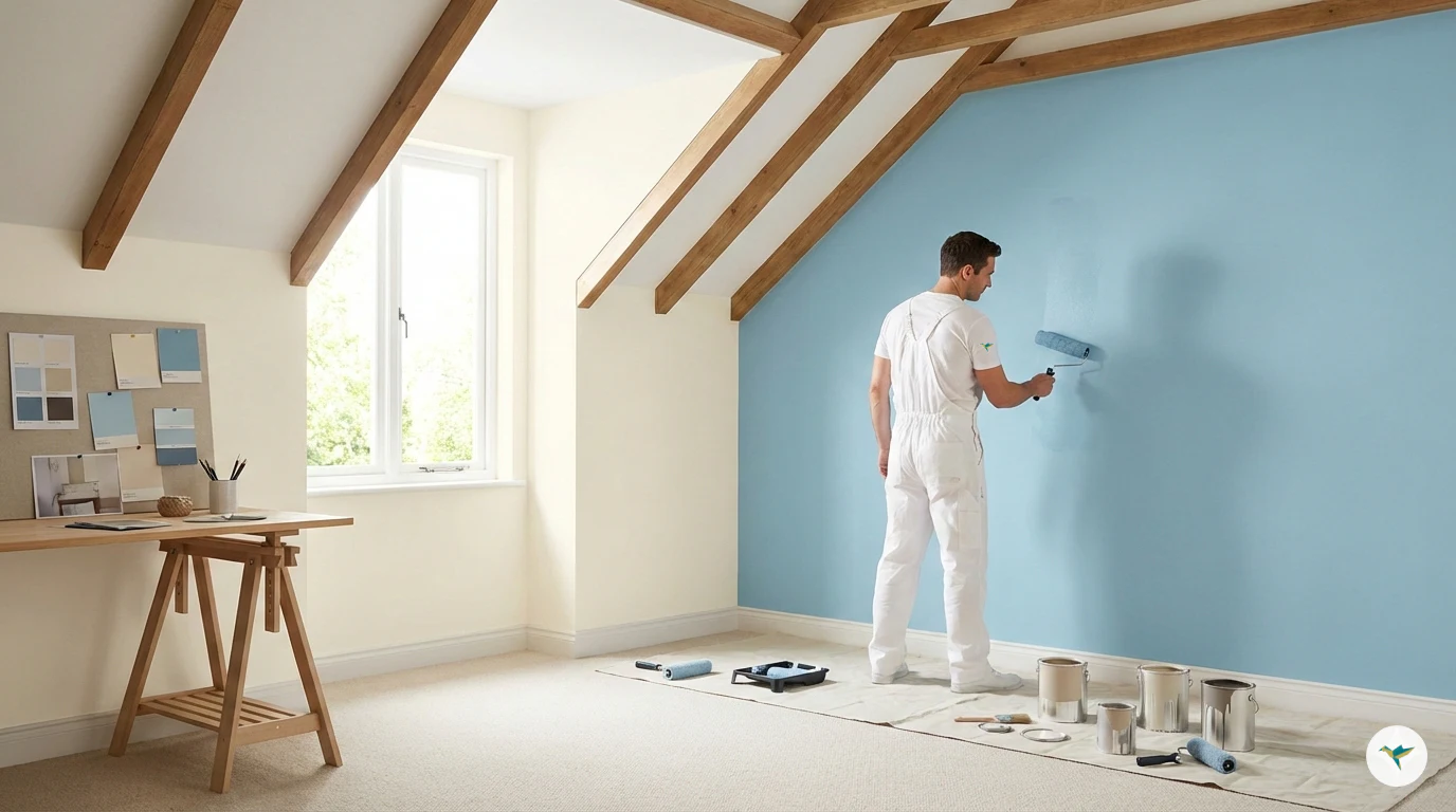
The One-Colour Strategy: Simplicity and Flow
Opting for a single colour for all four walls offers a distinct set of advantages, particularly in contemporary design.
Creates Cohesion: Using one uniform shade provides a clean, seamless look. This is especially effective in open-plan living areas or where the new room transitions into existing parts of the house, as it helps to maintain visual continuity.
Emphasises Texture and Form: When colour is uniform, the eye is drawn to the room’s architecture, fixtures, furniture, and materials (such as exposed beams, brickwork, or high-quality plaster finishes). This allows the craftsmanship of the build to take centre stage.
Simplifies Planning: From a project management perspective, a single colour reduces complexity, ensuring consistency across all surfaces and simplifying the painting schedule.
The one-colour strategy is a solid, failsafe choice for achieving an elegant and understated backdrop.
The Two-Colour Strategy: Dimension and Visual Interest
Introducing a second colour, typically an accent shade, is a more sophisticated manoeuvre that requires careful thought, but yields significant rewards in depth and character.
Defining a Focal Point: A darker or bolder colour on a single wall (the ‘accent wall’) immediately draws attention to a key feature, such as a fireplace, a built-in shelving unit, or the primary window view. This strategic use of contrast anchors the room.
Enhancing Spatial Perception (Making a Room Appear Larger): This is where a two-colour scheme can be an incredibly powerful tool, especially in a loft conversion where sloped ceilings or smaller footprints are common.
The Horizontal Stretch: Painting the two longer opposing walls a lighter shade and the two shorter opposing walls a slightly darker or warmer shade can make the room feel wider and more expansive.
The Ceiling Effect: The ceiling should almost always be the lightest element in the room (often a crisp white). Continuing the wall colour onto the ceiling for a few inches down the top of the wall, or conversely, keeping the wall colour very light and the ceiling brighter, can create an illusion of height.
Strategic Use of Trims: Painting skirting boards, architraves, and cornices a crisp white or a lighter tone than the wall colour creates a distinct edge that can define the room's boundaries and make the wall planes appear larger.
Additional Colour Tricks and Considerations
Regardless of whether you choose one colour or two, the following principles are essential for a professional finish:
The 60-30-10 Rule: For a balanced look, aim for this approximate distribution: 60% Dominant Colour (main walls), 30% Secondary Colour (accent wall, cabinetry, or major furniture), and 10% Accent Colour (accessories, artwork, and textiles). This ensures harmony and visual hierarchy.
Light Reflection: Always test your colours in the room’s actual light—both natural daylight and artificial evening light. South-facing rooms benefit from cooler tones, while North-facing rooms generally require warmer undertones to counteract the cooler light. A high-quality build deserves a high-quality finish; gloss and sheen also play a role in light reflection.
Matte vs. Sheen:
Matt/Flat: Hides surface imperfections well—ideal for walls and ceilings, offering a sophisticated, deep colour presentation.
Eggshell/Satin: Offers a slight sheen and is more durable and washable — best for high-traffic areas, kitchens, bathrooms, and woodwork.
The colour choice is an integral part of the overall design blueprint. We recommend finalising your colour scheme in conjunction with your flooring and lighting plans. Our commitment is to manage every detail of your project to the highest standard, ensuring the final aesthetic outcome perfectly complements the quality of the build.